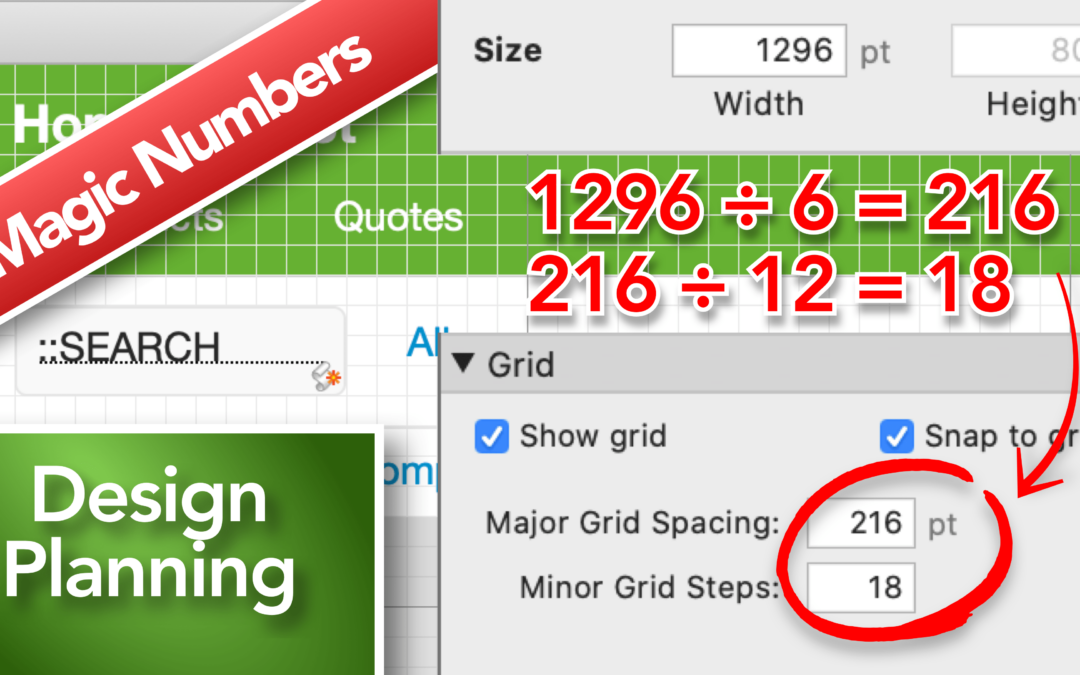
Designing within FileMaker can either be pretty easy or somewhat hard. There’s no exact way to design the look and feel of your solution, but the process of implementing the design can be easier when using FileMaker’s grid.
In this video, I talk about the process I use to first determine the size of a layout and then go on to refining its size so it fits within the golden ratio.
Finally, I talk about implementing my use of the grid to make the styling of objects easier and give myself some guidelines which makes the layout process much smoother as the solution grows.
Powered by WPeMatico


Neueste Kommentare